Going through the Good Omens box. This one was hard to get out the door and we apparated all the amazing support from all of y'all. We adore everything that went into this one and we hope you do too.
Updated: Nov 21, 2023
Updated: Nov 21, 2023
Going through the Good Omens box. This one was hard to get out the door and we apparated all the amazing support from all of y'all. We adore everything that went into this one and we hope you do too.
The 2023 Broadway SAL has passed the halfway mark!
For the third release we had Come From Away and Waitress.


Come From Away is one of my favorite musicals, and with the planes we knew we wanted it in one of the tall slots. I think the planes came out so well in this release, and I was happy with how many characters we were able to fit in as well.
For Waitress, we knew we wanted to include both neon signs, and of course the font had to be in neon as well. We chose the song 'Opening Up' because it's very well done in the musical, and went with the character pose that we wanted to use, and also because Tina and I worked in a cafe/deli and the song is a very good representation of the start of the day there.


For Release 4 we have Beetlejuice and Footloose!
These two designs were fun/difficult to design, because the space we gave ourselves was so small (we designed the frame, then went back and filled each section in).
For Beetlejuice we went with "The Whole Being Dead Thing" and modified our Beetlejuice font to be able to fit in the small space. We had to include Beetlejuice himself, as well as Lydia, and we added the snake because everyone loves the snake.
For Footloose we went with Ren and Ariel for the characters, dancing, of course. Lyric wise we had to use "Tonight I gotta cut loose, Footloose." The background is reminiscent of the background of the Broadway poster, with the coloring and the clouds.
If you haven't already, join our FB SAL Group: https://www.facebook.com/groups/730040497646157
A bunch of people have told us that they love the design insights posts we do for the SAL releases, so we thought we'd give doing a production/design insight post for the subscription boxes so that you can all see the process of us designing and putting the box together.
So this month's theme was Tamora Pierce. I've been a big fan of her books since middle school, when I saw a copy of First Test on the shelf at my local library. I went through all of Tortall and then moved right over into the Circle of Magic books, and even now I still go back and reread them regularly. I have to admit, we went a little overboard on this box, because I was so excited for it.
Booksleeve

We knew from when we chose it as a theme that we wanted to include a book sleeve with this one, but we weren't sure exactly what we wanted to do with it. Normally this results in us looking around for a fabric that fits the theme, but last year we invested in a Cricut machine (that we honestly haven't used very much since then - though it was useful in working on the scooby doo box, cutting out the mystery machine shape for the needle holders) and so when we were sitting and talking about ideas for what would work, one of us thought we could use it for the lioness shape from Alanna's shield. After brief consideration we went with the gold and red colors that are on the shield on one of the covers of Lioness Rampant.

Then when Tina and I were at the store we decided that we could just get white muslin and dye it ourselves (btw dyeing 7.5 yards of 108 in wide fabric in one go is fun). It took a couple tries to get the red that we wanted, but I'm pretty happy with how the colors ended up. Debbie got them all sewed together, with processing help from Tina. We bought a shimmer vinyl for the lioness, then realized that none of us had ever really done anything with vinyl before and we didn't know if we'd bought the right kind (we hadn't). After a little bit of panic we ended up switching over to the glitter gold, which worked beautifully.

For the closure, Tina suggested purple resin jewels for the buttons. There's actually three different jewel shapes that went out on these because those were the ones I liked from my jewel molds. I just went with a solid purple mica powder to make it bright and shiny. After I demolded them I turned them over and attached a button backing with another bit of resin.
Scissor Fob
Since we went with Tortall for the booksleeve, we went with the Circle of Magic series for the scissor fob.
We ended up landing on the idea of doing a scissor fob that had four evenly spaced lumps, using colors to indicate the four kids. Blue for Sandry, Purple for Tris, Red for Daja, and Green for Briar. When we were considering the type of beads we didn't want super modern looking beads, so we were happy when we found the smoother stones.
For the endpiece, we went with the Winding Circle symbol that's on the back of the medallions they get after the first series. Originally Tina was going to sculpt the symbol out of polymer clay to have me make a mold for the resin, but we were walking through Joann's and I saw this cute lollypop silicone mold. It worked perfectly for us. For the front we knew we wanted to create a little gradation in the blue. To get that effect, we did a first pour in a lighter blue, and then put a dollop of darker in each mold and gave it a gentle swirl. Behind that we poured gold, and I think the combination turned out looking good.
We decided to add a loop on them so that they could be closed into a bracelet because I had the thought that it should be able to close and form a circle, like the four lump string did in the book.


Patterns
For the patterns for the April box, we wanted to include something from every different series in Tortall, and we had several requests for patterns of Rosethorn/Lark from the Circle books, so the teachers are the ones we focused on for the box patterns.
For the Tortall patterns we decided to go full body, mostly so that we could definitely include the companions for most of them. We tried to stick as close as possible to the descriptions in the books for all of them, of course, and the fonts used on them are all inspired fonts on the book covers.
Starting with Beka Cooper - we chose to do a pose of her looking down at Achoo while in her uniform. The text in the background is from part of the big tracking/chase from Bloodhound.
Keladry of Mindelan is in a more active pose, swinging her glaive, while Crown flies nearby, with Jump at her feet. For the text on this one, I started with the Chamber of Ordeal giving Kel her task, leading into when she's passed the ordeal and become a Knight.
Since we already had a different pattern of Alanna, this one was labelled as The King's Champion, and the text in the background is from the scene where she's trying to protest the appointment.
Aly is shown with Nuwat, in crow form. We went with Trickster's Choice for the large words, because the background text I wanted to use was from where Kyprioth is speaking with her after showing her a glimpse of home.
Daine is on Cloud, and her background text is from the scene where Daine started to change into a horse while trying to feel the herd, and Cloud does everything she can to reach her and stop it before she can fully transform.
Numair's was a little odd to do, because I wasn't as confident with his appearance in Tempest in Slaughter. I've only read that one once. (I'll reread it as soon as the next one's out!) So we went with an older visual of him, and a visual representation of his magic. Since in Tempest and Slaughter he's still going by Arram Draper, that's what his pattern was labelled. (But if we do more, and I very much hope we can, he'll get a pattern labelled Numair.)
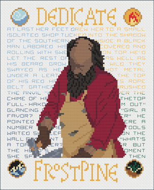
Moving into the Circle inspired patterns, we have one of each of the four main teachers, Rosethorn, Lark, Niko, and Frostpine. These ones were made to go along with the Circle of Magic inspired patterns that we already have for Sandry, Tris, Daja, and Briar, so they're not as large as the full body literary portraits. They do have some more embellishments though. We added the four symbols to each pattern, and did the same coloration we did for our other Circle of Magic inspired patterns, breaking up the background wording into four colors, each representing one of the students.
We did change how we did the literary portraits a little bit for these patterns (and it'll reflect in our Lyric portraits as well). Back when we first did the Circle of Magic patterns, one of the pieces of feedback we got was that a lot of people didn't like the broken up words on the right side edge, so we decided to give a more 'newspaper' style to the background words. This turned out looking great (in my opinion) because it gives a nice clean edge on the right side to match the one on the left. It does mean that the spacing between words is not always the same, and I was worried at first that might make it look odd, but it ended up not being that big of an issue.
All the above patterns were provided digitally, as patterns only in the box.
Finally we have the pattern we made for the Kit. We didn't want to go with something representing only one "world" or the other, so we went with a quote from Tamora Pierce herself that I've always liked.
I actually created a little freebie pattern for this quote when the pandemic first started, with medical professionals as the graphic. This one includes images from both "worlds" as the graphics. The sword is inspired by Alanna's books, the cat is Faithful/Pounce. Queen is represented in this one as well, along with an arrow representing Daine's series. The dragon is inspired by Chime from the Circle books. (I know he's supposed to have electricity running inside the glass, but neither of us could come up with a way to represent that in cross stitch in a way that looked nice.) Heroes has several fonts - one is one of our basic fonts, one is the same as the font on The King's Champion, and then the last is the Circle of Magic inspired font.
Overall I think the patterns came out rather well, and I was very happy with the box.
We are planning to submit our designs to DualWield to see if we can get them officially licensed, so wish us luck! We're going to update the background text on the other Circle of Magic patterns, and Alanna pattern, to match the way we're doing them now before we submit them, so it might be a few more weeks as we fit in the pattern updating between other pattern and production work.
